CSS margin, padding and background-image problems
In my previous post I was looking at problems with older versions of IE. It is always easy to poke fun at older browsers (and IE6 is getting on for 10 years old now) and as I noted at the time the problem migrates from browser to browser as time goes on, in the past it was Netscape 4 and undoubtedly it will be a different browser in the future. Recently I came across an issue that seems to affect IE6, IE7 and Firefox 2 and 3. Opera, Chrome and Safari seem to render correctly.
I guess developers tend to get quite grumpy about how different browsers render HTML because its often a struggle to understand how the standards should work and to find a common method that will work across all browsers especially when there are deadlines involved.
The issue relates to using a DIV the contains a TABLE. The containing DIV has a background-image and the contained TABLE uses margin to position it correctly. This technique is often used to display dynamic data over a pretty image. At first I thought the the problem was with the webkit browsers (Chrome and Safari) as Firefox and IE7 appeared to render the page correctly but, without being an expert in the HTML / CSS standards and given that IE8 and Opera also render the same as the webkit browsers I think that the problem is with Firefox and older versions of IE. However, lets face it it doesn’t really matter who is right and who is wrong as we still need to find a method that will work on all browsers.
In this example I have used a background image with a tall blue bordered heading row and a red border around the table cells. In this simple example the image is fairly primitive and there are only two cells of data, I’ve done this to strip the example back to its basics so that we can see what is happening with different browsers. The raw image looks like this.
The HTML uses this image as the background image for a containing DIV, the blue boxes are 50 pixels high and the red boxes are 26 pixels high, just for this simple example I’ve ignored the widths. The inner TABLE has a 50 pixel top margin to place it in the red borders. The HTML also makes the background to the page grey just so we can see what is going on.
<html>
 <head>
  <title>Margin</title>
  <style type="text/css">
    .page
    {
    	background-color: Gray;
    }
    .outer
    {
    	height: 76px;
    	background-image: url(border.png);
    	background-repeat: no-repeat;
    }
    .inner
    {
    	margin-top: 50px;
    }
  </style>
 </head>
 <body class="page">
  <div class="outer">
   <table class="inner">
    <tr>
     <td>cell1</td>
     <td>cell2</td>
    </tr>
   </table>
  </div>
 </body>
</html>
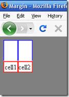
This HTML looks like this in Firefox
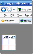
All appears to be well, I use Firefox a lot as Firbug is so good, the render is also like this in older versions of IE. However IE8 and the webkit browsers (Chrome and Safari) render it like this.
It would appear that these browsers are applying the top margin to the background image of the outer DIV as well as to the inner TABLE so that the image has moved down so that the text in each cell is no longer in the red boxes.
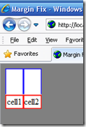
The solution is to use top padding on the outer DIV rather than top margin on the inner TABLE. Its worth noting that the HTML for the page does not need to change – only the CSS.
<html>
 <head>
  <title>Margin Fix</title>
  <style type="text/css">
    .page
    {
    	background-color: Gray;
    }
    .outer
    {
    	height: 76px;
    	background-image: url(border.png);
    	background-repeat: no-repeat;
    	padding-top: 50px;
    }
    .inner
    {
    }
  </style>
 </head>
 <body class="page">
  <div class="outer">
   <table class="inner">
    <tr>
     <td>cell1</td>
     <td>cell2</td>
    </tr>
   </table>
  </div>
 </body>
</html>
This HTML renders like this in all browsers.
This is obviously a problem as IE8 has already been fixed and its probable that a future version of Firefox will also address this problem which will mean that pages that use this technique will need to be fixed.


